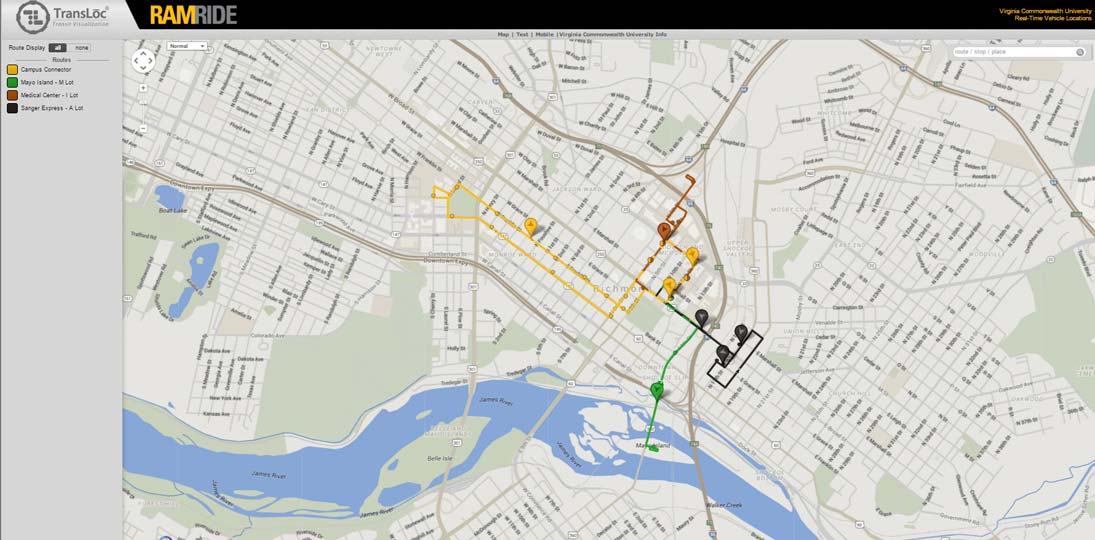
Let’s talk about how you can integrate content that already exists on the web or in another system you’re using. One of the most popular sources we’re seeing lately on digital signs is bus and shuttle mapping.
Showing shuttle and bus maps on your screens gives your audience content they care about, and allows them to wait for their ride in comfort instead of sitting outdoors in bad weather. This can also be a safety issue, especially on college campuses. If riders can see where their bus is on the map, they don’t have to wait outside at night or in poorly lit shelters. Instead, they can wait indoors and arrive at the stop just before the shuttle does.
In most cases, you’ll want to install digital signs with shuttle mapping near exits so that people can check their bus on their way out.
You can integrate a webpage showing your map into a content block, or use a hot-spot to jump to full-screen kiosking. In most cases, you’ll want a touchscreen design to get the most out of the application.
Depending on how much interactivity you want your maps to have, you might need a multi-touch display. That will allow people to zoom in or out on the map the way they’re used to on a smartphone or iPad. However, you can also offer arrow controls or simply let users move around the map with a single fingertip if you want to avoid the cost of a multi-touch screen.
TransLōc is one passenger information system that shows real-time shuttle mapping, and offers riders a safe, comfortable, and convenient wait for the bus. One of TransLoc’s advantages is that your audience can take the map with them when they walk away from the sign. They offer smartphone apps, SMS text messaging, universal mobile website and an OpenAPI so you can offer your audience an array of ways to access the information.
