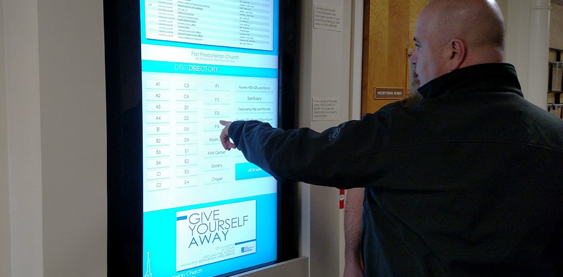
Engraved plaques are out, digital directories are in. Digital building directories allow for more options, are easily changed and updated, and end up saving you time and money in the long run. They look great, and the design scheme can be customized to whatever you want, making a digital directory a legacy product that will weather any and all changes to your building in the future. You can redesign and upgrade your lobby and, in just a few easy steps, alter the look of your directory to match.
And from a single computer, you can use digital signage software to manage one or even hundreds of screens, while simultaneously sending messages that target tenants and visitors alike. You can even advertise spaces for rent, if that’s applicable to your organization, or sell advertising space to current tenants, increasing revenues and giving you some powerful ROI.
You want a system that’s easy to use, easy to update and scalable. You’re looking for a single solution you can get now that will last for a long time, and that gives you maximum flexibility. It’s possible to use an out-of-the-box templated directory design, though it might be more advantageous to have a custom creative layout that exactly suits your specific needs and growth projections.
The look of the touchscreen directory is the first hook, the thing that gets people to want to use it. Make sure any text is short and concise (three or four words is usually enough), but also large enough to read easily. And don’t make your interface too complicated – controls should be intuitive, and it should always be possible to go back to a previous listing with little effort.
And keep it clean – cluttering the screen with a bunch of unnecessary stuff will make using the directory seem like a burden. Older people, who maybe are not as comfortable with digital technology and touchscreen UIs, will especially appreciate a design that makes sense and is to the point. And don’t forget about ADA guidelines.
Don’t overburden your audience – you want options, not distractions. Having said that, you can certainly integrate your digital directory with your digital signage, including current time and weather, maybe a news ticker, and a window in your design template that display messages that are on other displays in your digital signage deployment.
Easy to use is important, as is easy to read. One thing people often fail to take into account is the lighting. You don’t want glare on your screen – so make sure it’s placed somewhere where sunlight doesn’t render the screen unreadable part of the day. Fonts should also be easy on the eye – some digital signage providers suggest only sans serif fonts for electronic displays, while others suggest that serif fonts are better for something that might be text-heavy like a digital directory. You should test out various options, keeping your audience in mind, to see which one works best for your specific location and audience.
Consistency is vital – if you have navigation arrows for forward and back in the lower right corner on one page, then they should be there on every page. People get used to a particular interface very quickly, provided it’s internally consistent. Accuracy is also key – people tend to trust digitally displayed information (after all, they use their smartphones and computers every day to get anything from the news and sports scores to restaurant menus and business opening hours), but everything needs to be absolutely correct. That includes spelling and grammar – just a single typo can invalidate the entire directory in some people’s minds.
Get feedback from your audience from time to time so you can evaluate how effective your digital directory is. And make sure you have access to update your style sheets and data, so it’s easy to make adjustments to colors, fonts and so on, and also easy to update the directory information as need be.
And you can control and update information on several different directories at different locations, even in different buildings in different cities (as long as you have access to the design and directory files) from a single computer, or even a mobile computing device that has been set up to access the UI.
All things considered, however, it really comes down to functionality. The cleaner your design, and the more consistent every bit of information provided is, the more authority your directory has, and the more pleasant it is to use. You want people to be pleased that you’ve switched over to a digital building directory, not pining for the good old days when your offered something that made sense to them.
