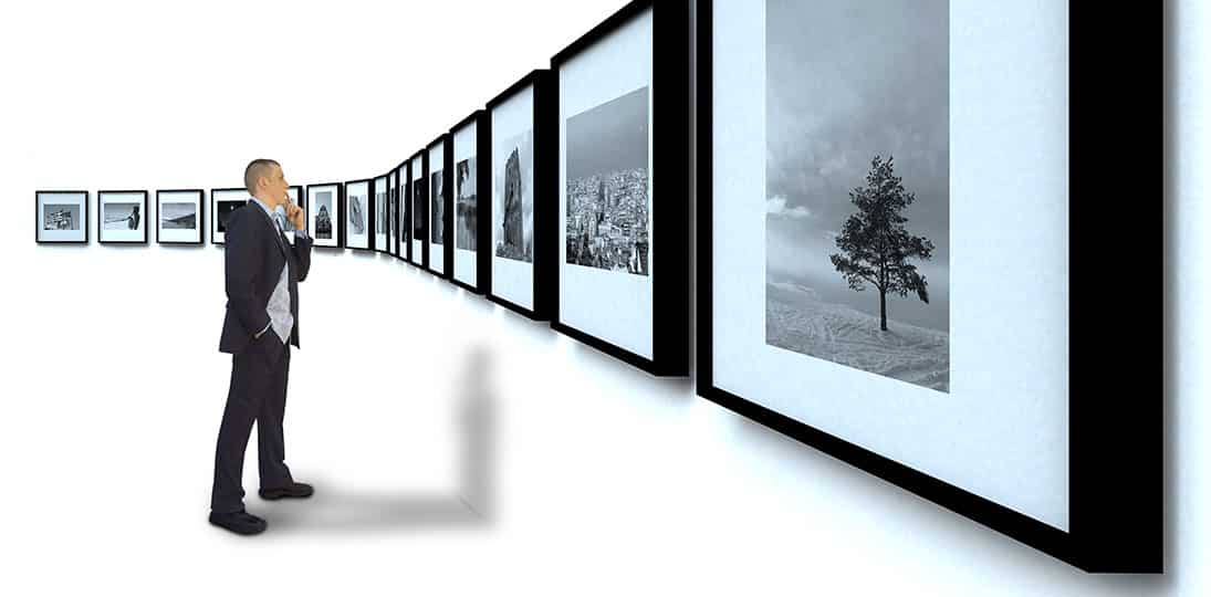
A digital signage layout is the arrangement of items on your display. It’s made up of a background image that fills the screen and any number of blocks for messages, tickers, date and time, etc. placed over that image.
You may have a beautiful screen design with your brand elements and interesting content, but to successfully engage your audience, you need more than one. We suggest you use a minimum of three layouts and change them hourly. Here are the top reasons why:
1. Draw More Attention
Engaging your viewers begins with grabbing their attention. If you use the same layout all day every day, people will become used to it and pay less attention over time.
You see television news stations switch between full-screen shots of anchors, video surrounded by tickers and sidebars, and multi-window commentators for just this reason. They know that to keep people’s attention, your content has to be presented in dynamic, changing formats.
2. Reach Different Viewers
Different audiences need different layouts. If you have a screen in an area where people pass by quickly, you have a better chance of them noticing a single announcement than trying to decipher three message blocks and a ticker in just a few seconds.
On the other hand, if you have an area where viewers spend more time, like a lobby or lounge, you can put more on screen since they have more time to read and comprehend more information. (Read our blog post about layouts for three kinds of viewers.)
3. Improve Readability
If you’re using 16:9 PowerPoint slides, video or messages, you want to make sure there’s enough room in your layout so that content isn’t shrunk down or distorted.
You always need to keep aspect ratios and resolution in mind when designing both messages and layouts, and you need to make sure different messages have enough room to be readable from a distance. Because you’re probably mixing 4:3 and 16:9 content, different layouts give you different arrangements to maximize the impact of each.
4. Avoid Burn In
Burn in is caused by leaving a static image on the screen over a long period. Over time, you’ll see a “ghost” or burn in of that image. Although LCDs are much less prone to burn in, they aren’t immune to the effects. For LCDs, we call it “video memory” or “image retention” – it works differently but the result is the same.
If you use one layout with a pattern, logo or content blocks in the same place all the time, those elements can burn in and ruin your screens. By changing layouts every few hours, and making sure you don’t repeat design elements in the exact same place, you can avoid burn in and extend the life of your displays.
