Higher education institutions want to attract the best students they can, and having a good housing program can help do that. Housing options, and the quality of the housing, can sometimes be a determining factor in whether a student chooses this university or that one. This could mean anything from updating and modernizing old housing to building innovative new housing projects. But solutions such as these can be incredibly expensive and can take years to complete.
There’s a faster and more affordable solution available – a comprehensive interactive project for digital signs that makes choosing and getting around campus housing easy and fun, like the award-winning design completed for the University of Kansas by Visix.
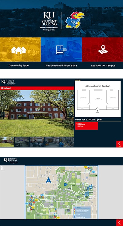
The start screen features three different color-coded ways to search for housing. Interacting with the yellow area gives you three types of buildings to search – apartments, residence halls and scholarship halls. When you select one of the structures in any of the building categories, you see a picture slideshow that shows a large photo of the exterior facade and several pictures of interior spaces. You also see available housing with specific information – how many people each unit is for, a floor plan with dimensions, a listing of amenities and the cost for a school year.
That’s just one way to search for what you want. Interacting with the blue area on the start screen lets you search by size – 1-, 2-, 3- or 4-person units, and there’s also a link to the scholarship halls. But maybe location on campus is more important to a potential or incoming student. Interacting with the red area takes you to a campus map, with pins in each of the housing locations. Clicking on a pin takes you to the page for that structure showing available units. The map also includes bus stops, wheelchair accessibility points and landmarks on campus, such as the library and dining halls.
This custom interactive project mirrors information available on the KU Student Housing webpages, but adds real-time information on which units are currently available, and much more detail about the actual living spaces. This can save someone an enormous amount of time and energy – imagine choosing a residence hall based on the webpage description and pictures, only to find out later there’s nothing available there in your price range. You’d then have to go back to the drawing board and start your search over again. By using Visix’s interactive housing project, you only see units that are available right then. This information is automatically updated, so it’s always accurate and current.
The project is placed where prospective students and parents begin and end their campus tours. Since prospective students may not be able to see the inside of every housing facility, they can see the outside on tour and use the interactive screen to check out photos from the inside.
Giving people three options for sorting through the available information makes things much easier for them. This takes into account different priorities and styles of information searching, and gives the students a more consumer-like experience when searching for, and referencing, on-site housing.
People today are used to getting information in their own way, using computers and mobile devices, and institutions that continue that style of information sharing are seen as more modern and feel more comfortable to deal with. And it’s not just the students who will be pleased with the three options – parents and visitors will also appreciate having so much information available in such an easy-to-parse manner.
This project is part of KU’s commitment to streamlining the process of getting good housing. First you sign a contract, and then choose where you’ll actually live, as well as your dining plan and roommates.
The award-winning Visix creative services team is happy to have been a part of KU’s plan to take the stress out of the housing selection process, and show potential students that the University of Kansas is a forward-thinking institution of higher learning.