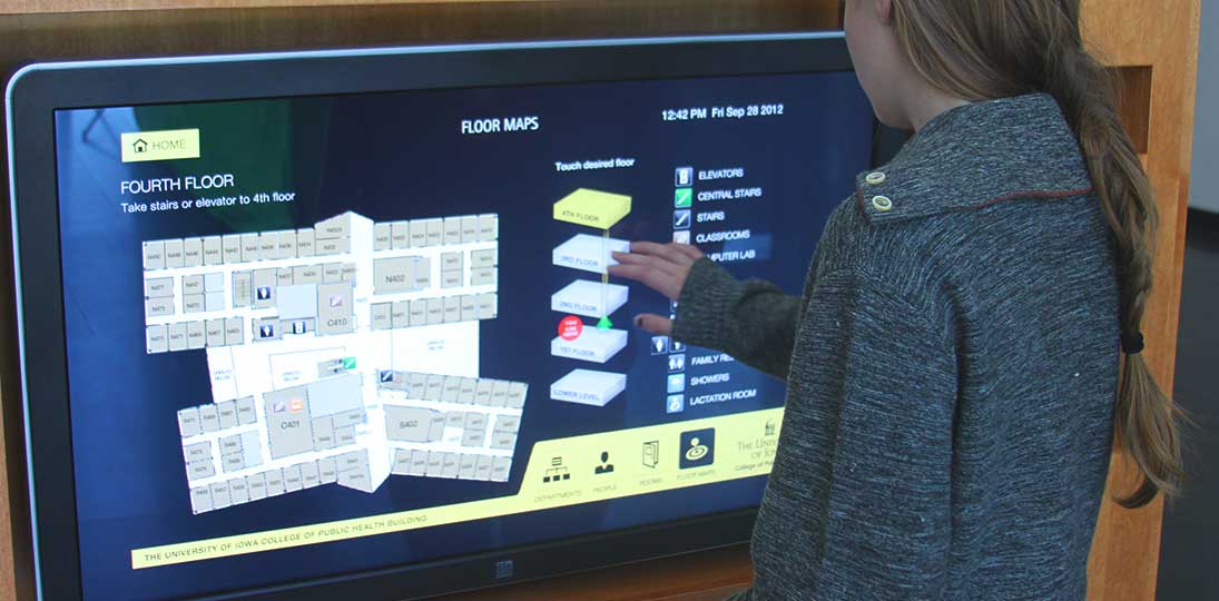
People today are accustomed to having some degree of freedom in how they access information. Institutions of all types can take advantage of digital wayfinding to give their audiences a more modern approach to navigating their properties and getting where they need to go. Here are the top ten benefits of digital wayfinding:
1. It’s the New Normal
People expect information to be, if not wholly interactive, at least presented in a way that is similar to how they get their other information. All day long, people spend time on their computers and mobile devices, looking up everything from sports scores and discounted airline tickets to local weather and transportation schedules. Modern institutions aim to give people what’s being called “a consumer-like experience”. Places that are still using brass plaques and paper notices are increasingly seen as old-fashioned and out of touch.
2. It’s Ecological
No more paper, printing and waste – which is not only more environmentally friendly, but is also cost effective. And no one on staff has to take valuable time going around putting up and taking down notices and signs. In the long run, digital is cheaper than continuing to print out information.
3. It’s Self-Service
Because interactive wayfinding is essentially self-service, it frees up staff from giving directions all day long, and gives them an opportunity to be more productive and focus on giving more personalized attention to visitors. This helps increase both visitor and employee satisfaction.
4. It Reduces Stress
Trying to find where you need to go, or who you should go see, can sometimes be a stressful situation. Because interactive wayfinding provides a guide that each person can search at their own pace, people feel more in control and therefore more relaxed. This creates a positive visitor experience for them, and makes them think favorably about your institution. And because digital wayfinding is more efficient, there’s less congestion in corridors and lobbies – people go to the screens or kiosks, get their information, and then head off.
5. It’s Attractive
Good design is essential to any successful digital wayfinding deployment. Adding some motion can draw people’s attention to the touchscreens or kiosks, and get them interested in other items displayed within the layout. Imagery and color schemes can reinforce your brand. And if your design uses CSS style sheets, anyone with basic CSS knowledge can easily make design changes on the fly, as needed.
6. It’s Flexible
There are many, many different ways to present information – from animated 3D maps to 2D floor plans to event listings and searchable directories. Each element can be presented in multiple ways, all accessible from a single screen. Information can be presented, sorted and searched alphabetically or by rooms, departments, people, floors or upcoming events. This lets people view the information any way they prefer, so all types of mindsets and preferences can be serviced with just a single kiosk.
7. It’s Integrated
You can present things in a way that best suits the specific information on offer, and you can easily and quickly update what’s on the screens. Either your database feeds your digital wayfinding (so changes made there automatically appear on your displays), or you can use a simple web-based UI that allows you to make changes quickly from any web-connected device. You can also tie in to your calendaring or event scheduling software.
8. It’s Responsive
Using HTML5 to design your wayfinding allows people to take their directions with them as they go. This is a responsive format that scales to whatever screen it’s displayed on, so one deployment can service any kind of screen or mobile device. Expanding to a mobile app can give turn-by-turn directions along with photos of landmarks for easy reference, and can actually track where a specific person is in the facility and give them directions right from that spot.
9. It’s Inclusive
With well-thought-out design and navigation options, good interactive wayfinding is ADA compliant. This means that everyone can have the same, equal access to the information you offer as a fun, modern experience, regardless of any disabilities they may have.
10. It’s Deep:
Digital wayfinding can present an amazing amount of information on a single screen using an easy, intuitive interface. By adding hot spots and buttons to switch to different display modes, the screen can double as extra real estate for your general digital signage messaging, social media posts, energy dashboards and more. General information, such as current date and time, weather, traffic and news, can also be part of your layout. You can even include other facility information, such as history and overall mission statement, or even menu items currently on offer in an on-site café.
Want to learn more about the benefits of digital wayfinding? Check out these other resources:
- Blog: Why Your Wayfinding Signage Should Be Digital
- White Paper: How to Choose the Best Wayfinding Option
- Infographic: 10 Steps to Successful Digital Wayfinding
